Firstly, i chose to annotate VIBE magazine; urban selection aimed at hip hop and RnB listeners.
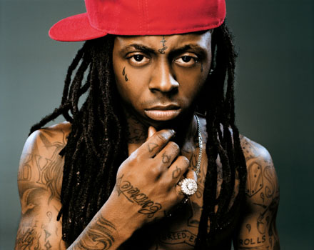
The generic music convention codes emploed by the magazine suggest the target audience are young people on the go and enjoy having fun. On the front cover is very successful rapper;
'lil wayne'. He is of african american decent, which tells me the mag is aimed at a
multicultural target audience. Caption on front cover is related to him by advertising
'77 best weezy songs inside'. Apart form this, there are many relevant artists names scattered around the image to capture fans attention. another thing i realised is that the magazine related to
basketball because it offers the reader the chance to preview the NBA. The mode of address
 The second magazine I chose to annotate in comparison with VIBE is 'KERRANG' magazine.
The particular front page i chose to study has a band named
Machine head', i can tell that the magazine is aimed at an audience that prefer the genre of
rock music because the artists on the front page look
ruthless and out of control. The poses strike the eye of the reader the most because one member of the band is grabing the othere with his arm and they are all staring at the camera with madness and
intensity. Also the artists are wearing gothic make-up which tells me as a reader that they follow a fashion trend that the
stereotype would wear. Aswell as the band, there are many other images reflecting tasters of whats inside the mag, whereas, in Vibe magazone there is only the one main image used.


